Select Projects 2010-2015
Coupons.com Incorporated provides digital coupons, including online printable, social, mobile and loyalty card promotions. www.coupons.com is the 43rd largest website in the U.S. (Nielsen, April 2011).
The DFSI™ is the company’s "digital free standing insert" (i.e. the digital version of the industry’s FSI or free standing insert that is included in Saturday/Sunday newspapers across the country). The Coupons.com DFSI spans tens of thousands of websites—ranging from lifestyle and recipe sites to coupons/savings blogs to TV, radio and newspaper websites—with Coupons.com at its core.
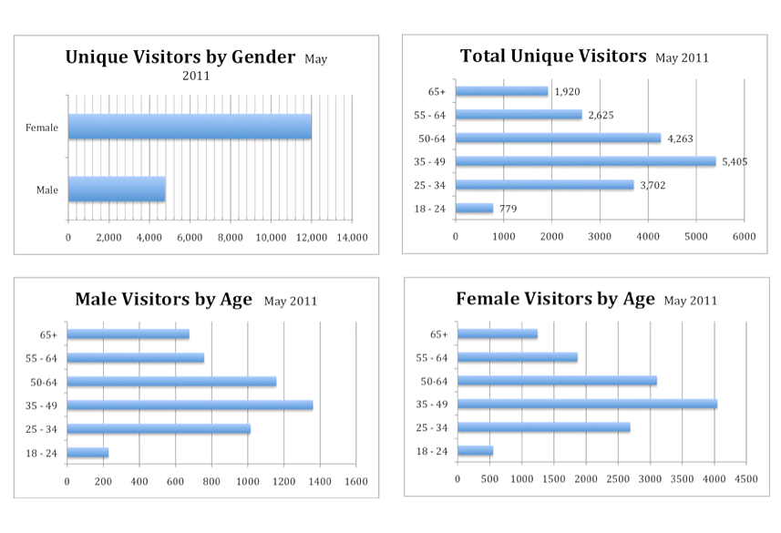
Anecdotally and from personal experience, it was recognized internally that the website, without any significant redesigns in 4 years, had become more difficult to use. We have no session data per se, but Google Analytics plus Bright Tag pixels gave some insight into this situation.
This is what I learned from people in accounting, data scientists in
product, product managers, online marketers, customer account managers, Google Analytics, BrightTag, and more:
Out of 5,000,000 or so visitors to the site in a month, XX% clip (i.e. select) one or more coupons, then XX% of those clippers exit the site, and of the remainder, XX% go to printer control install page, where only XX% successfully install the software necessary for printing coupons.
(The first number is correct; the rest are removed on purpose.)
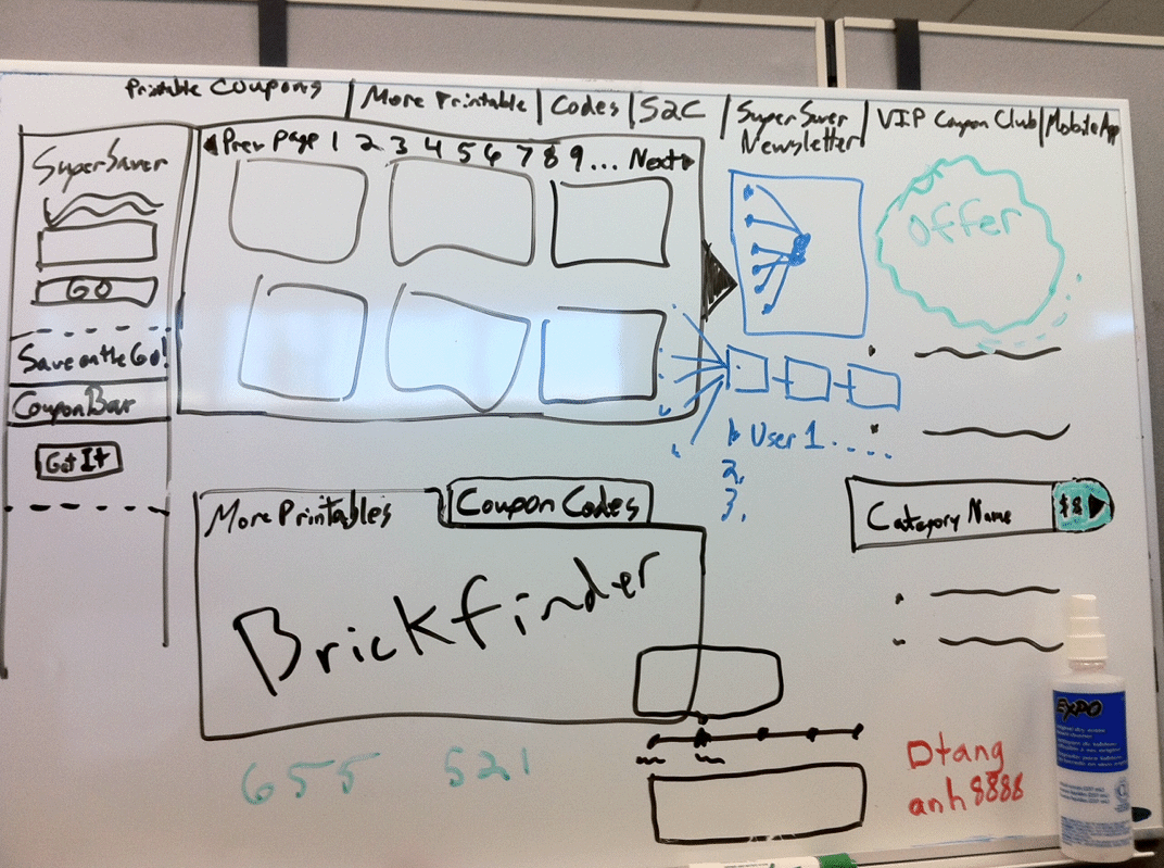
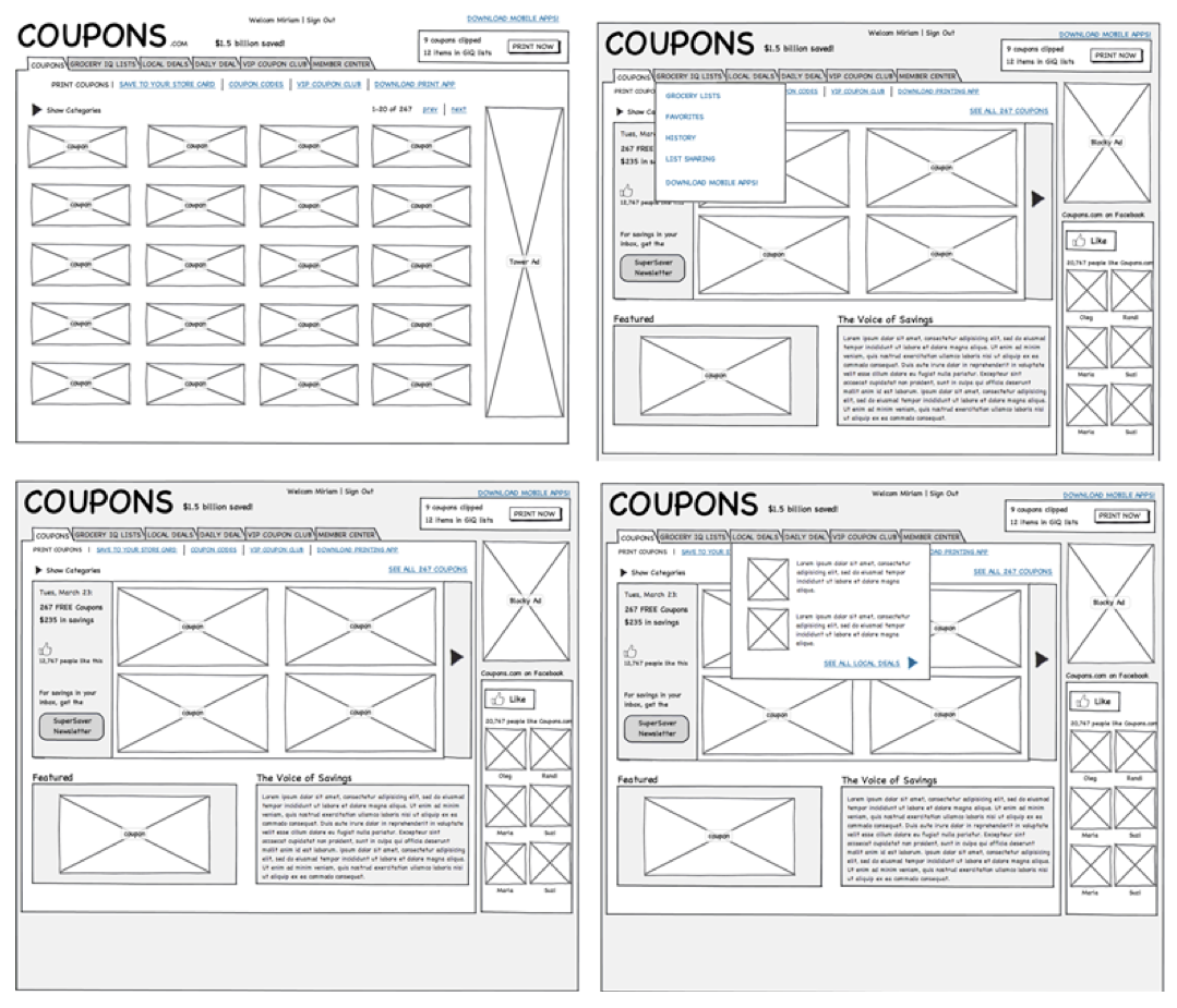
The prototype was created to be a platform for testing changes without taxing engineering. Since animation and searching/filtering actions needed testing, I implemented it with a jQuery plugin and got pagination (including coupons per page), category filtering, and search as well. The data set is one day's JSON object from an RSS-type feed.
As a platform for testing, the prototype is a great start. However, the visual design needs to be refined for more objective testing, and there needs to be variations which only alter one or two features from the original site so we can test the changes in a reasonable sequence without introducing too many variables.
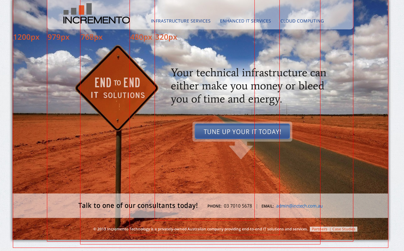
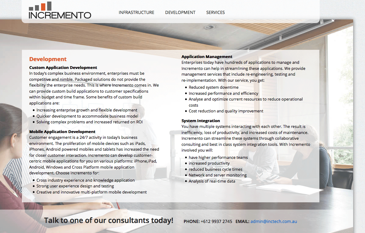
Incremento Technology is an Australian company offering technical infrastructure services. Their website was an outdated calling card. They asked me to modernize it in every way as an attractive advertisement to generate call-in business. To do so, I began by modernizing their brand -- logo, colors, text, call to action -- then extended that to the style and structure of their new, responsive website.
This was pure web design without any application architecture to consider. The message was the only measure of success: did viewers 'get' the brand? Did they feel confident and compelled to call in?
So I began with the most iconic photo I could find. "End to end" solutions had already been proposed as a tagline by the Inctech guys. When I saw this photo, the vanishing point spoke loudly to me. And I had enough canvas on the sign to write in a tag line. The burnt orange brand color was picked out of the photo's sands.

I love reducing a complex business offering to a simple binary proposition, thus the site's main message overlayed on the photo: "Your technical infrastructure can accelerate your success or bleed you of time and energy."
This code has been stripped down to semantic markup (mostly) so that without the
stylesheet applied, the content was still in the right order with the right hierachy of default heading sizes, etc.
This makes the addition of the responsive behavior much simpler to implement and less complicated to debug. I always
deliver clean well-commented code:
This was the first responsive site I coded by myself. Fortunately, the visual design portion came in under schedule, so it was less obvious that the coding went over schedule! Mobile-first (progessive enhancement) coding would have made everything simpler and stronger from the beginning.
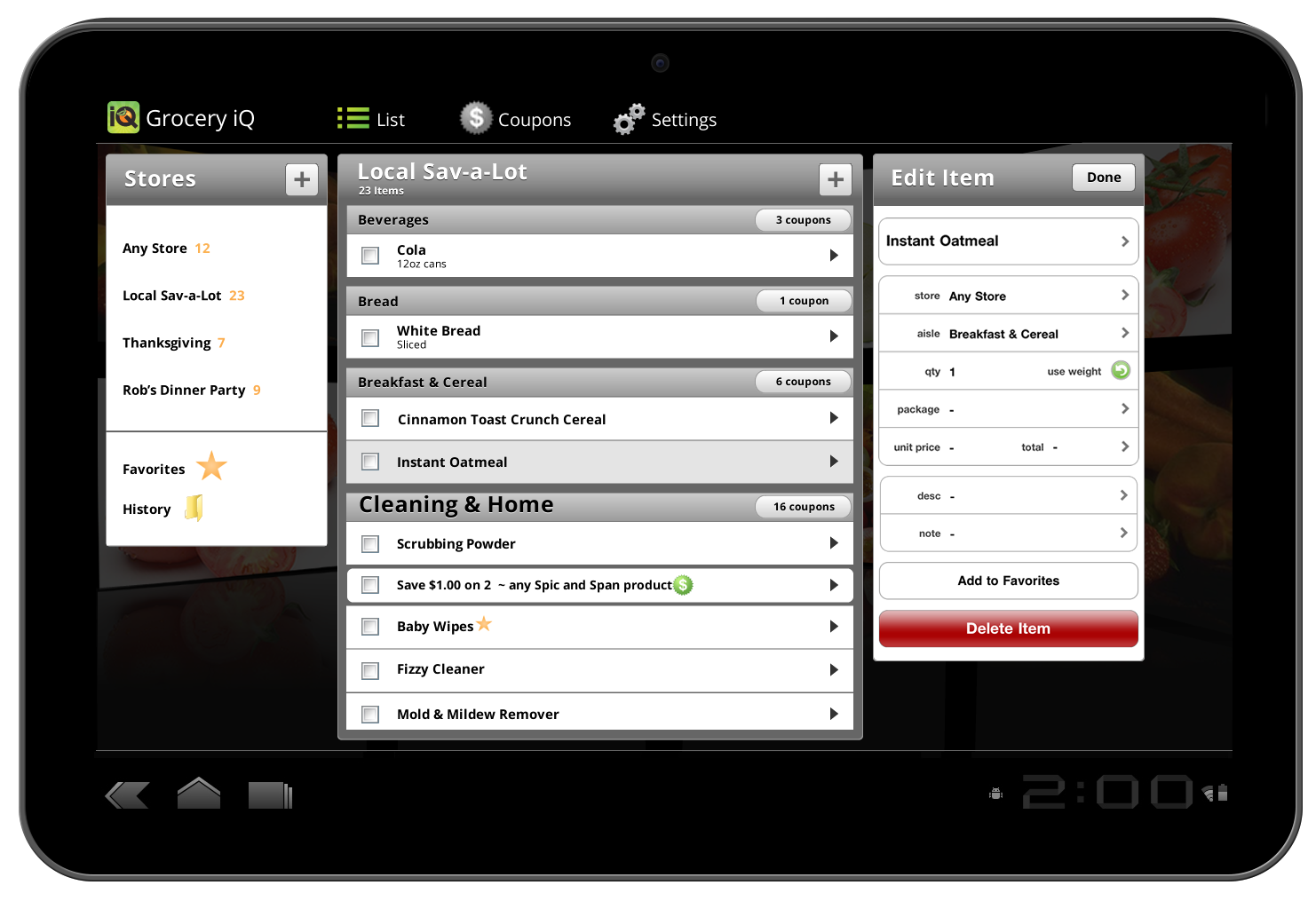
In January 2011 at CES, Motorola released the Zoom tablet in partnership with Google. It would be the first tablet running Google's new Android Honeycomb OS. For its actual market release event in February, Google wanted more pre-loaded software and invited in a few companies to update their apps to the new OS before it was officially released. The Grocery iQ iPhone App was invited if we could port it to a tablet size and a completely different operating system in 10 days.
So we went up Highway 101 to the Google campus and the developers went to work on these big, bolted-together versions of the tablet, while my co-designer and I absorbed the Android styleguide and the crazy assets we would hand off (9-slice PNGs?). It was intense, but we all made our deadlines and the press event was very significant for Coupons' subsequent capitalization.
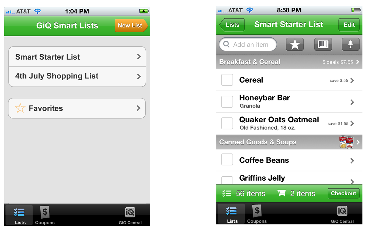
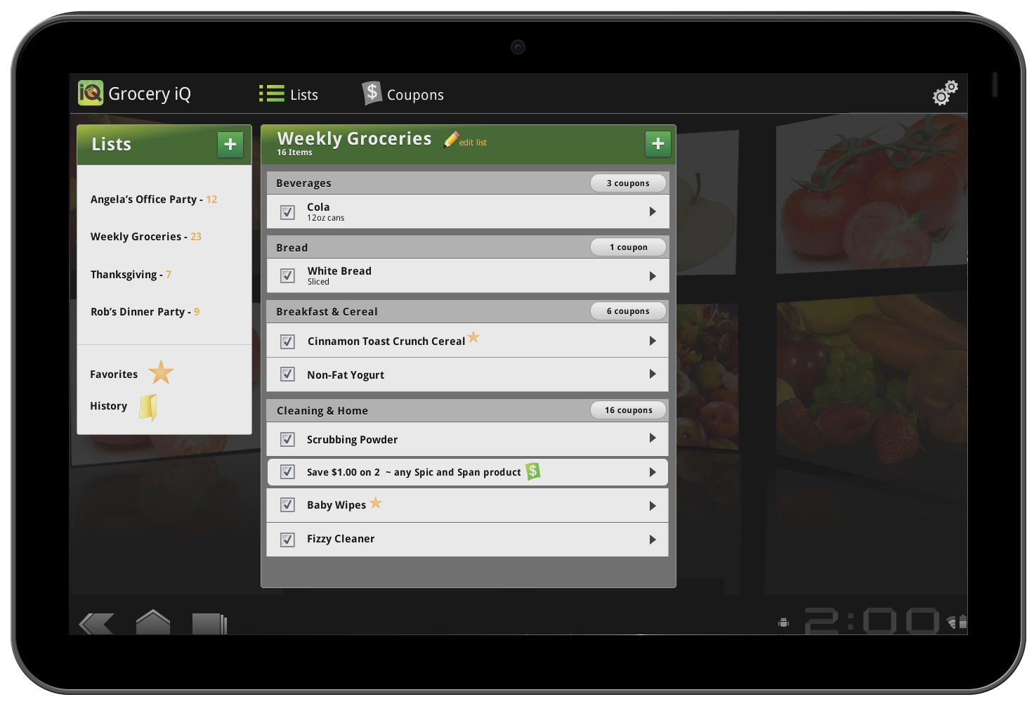
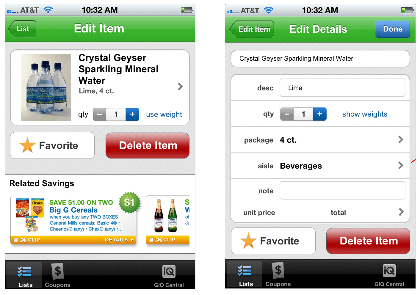
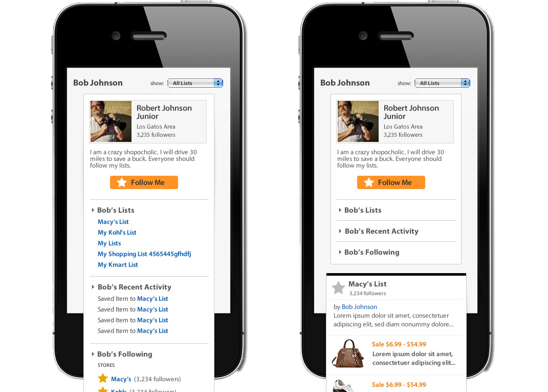
This app existed before my time. When I came into the picture, it had approx 500,000 installs. And its information architecture was flawed: to create a new list, you had to first create a new "Store." That was the developer's thinking: 1. create a store with aisles and sections & 2. create a shopping list for that store. Modern design patterns made it much more likely that a user would think the lists were the central things and everything else clustered around them.
In a total of two major app store release versions, I corrected the IA and we integrated multiple item voice input, barcode scanning, and an image database for virtually all packaged goods manufactured in the United States.
Newspaper companies faced with the prospect of falling car sale ad revenue, formed a company to get ahead of the curve and be the Internet destination for the next generation (literally) of car buyers. That was Cars.com. It worked out fine for them.
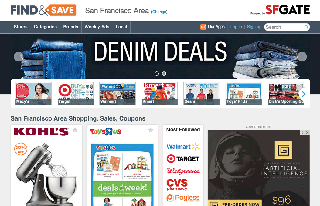
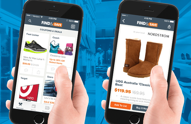
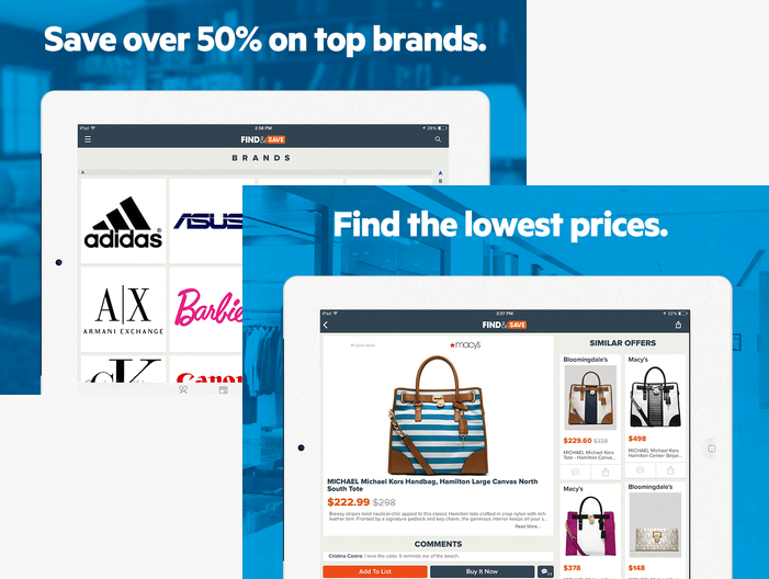
In 2012, a new group of media companies formed around the idea that the vital advertising channel of newspaper inserts was dying and they needed another Cars.com. They came to Silicon Valley for veteran leaders, product designers, and developers and formed Wanderful Media.
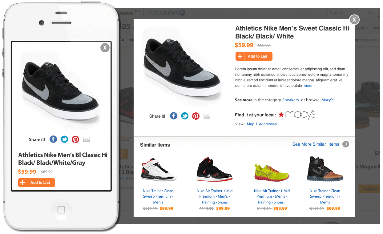
The concept was an iPad browsing experience that was delightful. Without capacity to launch with a native app (we were starting from an existing feed integration website), we focused massively on the backend, on the one hand, integrating product data from all over in new and interesting configurations (that gave developers headaches), and on the other hand, we focused on a content-rich completely responsive interface that felt handcrafted on anything iPhone 4-sized or larger.
For 3 months, we had target users of the system coming into the office. We conducted industry focus groups with our board members. We prototyped solutions from clickable Balsamiq wireframes to wireframe level native app prototypes. At every stage we tested with users. On November 25, 2012, we formed the founding team. On April 15, 2013 we launched the product in a few regional newspaper markets, increasing that coverage to 30+ in a few weeks.
The design team was awesome. I hired a young designer/developer first who proved to be super-competent at everything he did. Then I hired a seasoned pro designer who came with refined visual style and could also code the heck out of an HTML email (which is kinda like voodoo).
The larger team was equally awesome. For instance: the front end developers worked themselves hard to get the responsiveness just right for launch; the software architect and back-end developers took in multiple data feeds, scraped and beat the data into shape, then served them up in all sorts of weird ways we asked for. They made the previously impossible, possible.
With my Product Manager partner, I researched existing Employee Engagement software and services, interviewed several HR executives (at PayPal, Xerox, etc.), spoke with internal stakeholders/domain experts, and then continually tested our ideas with a core group of these people. "Employee Engagement" is a domain with a lot of buzz in human capital management circles and it was important to get solid Labor Bureau stats and really understand the core drivers of employee engagement and why a business might invest money in a solution we invented.
With my partner and a large room with whiteboard walls, I brainstormed ideas, modeled possible interactions, and then iterated with wireframe mockups.
Product Definition Cycle : Approx. 2 days in ideation/design > test with 1-2 live, fresh humans > then repeat the cycle...
Total Product Cycle : 3 months from blank slate > research > modeling & testing > protoyping > building pilot > minimum viable pilot complete
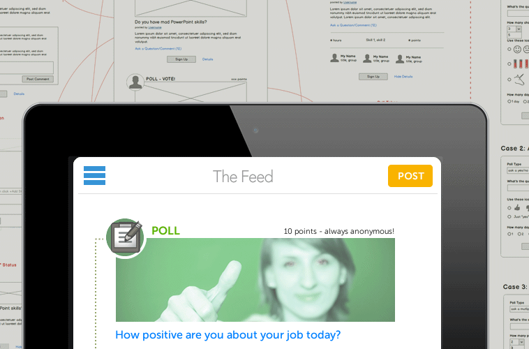
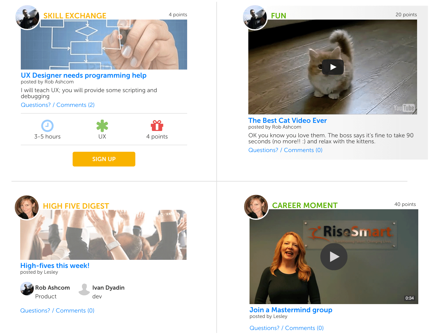
These are the four core modules of the prototype built on HTML, CSS, jQuery Mobile, and javascript. Other modules include variations of polls and various tyoes of content/video sharing. A pair of contract developers took these working modules (try clicking/tapping on things) and made a mobile-first prototype out of them with jQuery mobile. The plan is to have a Minimum Viable Pilot that runs 30 days at a local company interested in the solution. We had many volunteers and found, generally, that the HCM space was starved for useful, desirable software and willing to experiment.
We had to be rigorous in our user research at Wanderful; it was the only thing everyone in the organization respected. Dmitriy came up with this idea of using our regular testing program to test the basic assumptions and habits people had with touch interfaces, including our competitors and our own prototypes -- things like touch-and-drag for "Add to List" interactions, vertical vs. horizontal swiping/scrolling, etc.
So we brought in specific kinds of shoppers (our usual target users who are extremely value-conscious) and recorded them answering questions and performing tasks; then edited that footage together into a Users' Voice reel of answers to contentious UI questions in the office. As part of a larger presentation, it was stunningly successful.